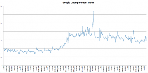
There are lots of ways to measure unemployment (and underemployment, and labor participation, etc.) … but it’s always nice when somebody uncovers a method that cuts through the manipulated clutter government spoon feeds to the unsuspecting public.
Like this chart from Suffolk law student Petr Pinkhasov – which tracks “unemployment related searches on Google” over the last eight years.
Nice work dude!
Of course there’s no shortage of charts lately showing the complete lack of “yeast” in America’s so-called recovery.

4 comments
Interesting that there is a spike every January – must be a New Year’s resolution coming to fruition.
I’m not quite sure how a 7 day Moving Average can spike either, period. Woud be helpful for an explanation.Interestingly, I “googled” for an clarification and couldn’t find it.
Probably nothing more than compression of the x axis – the graph shows eight years worth of data.
South Carolina pundits proliferate. There’s always room for another laptop on the pickle barrel.